
The first reason was simple: we wanted the app to feel more at home on Android. Part of that was cosmetic, adopting Google’s Material Design look and feel. But it also meant making better use of Android design patterns, including the Floating Action Button and the system back button. The second reason was broader: we saw this as a chance to revisit the design from the ground up and make it better.
Navigation
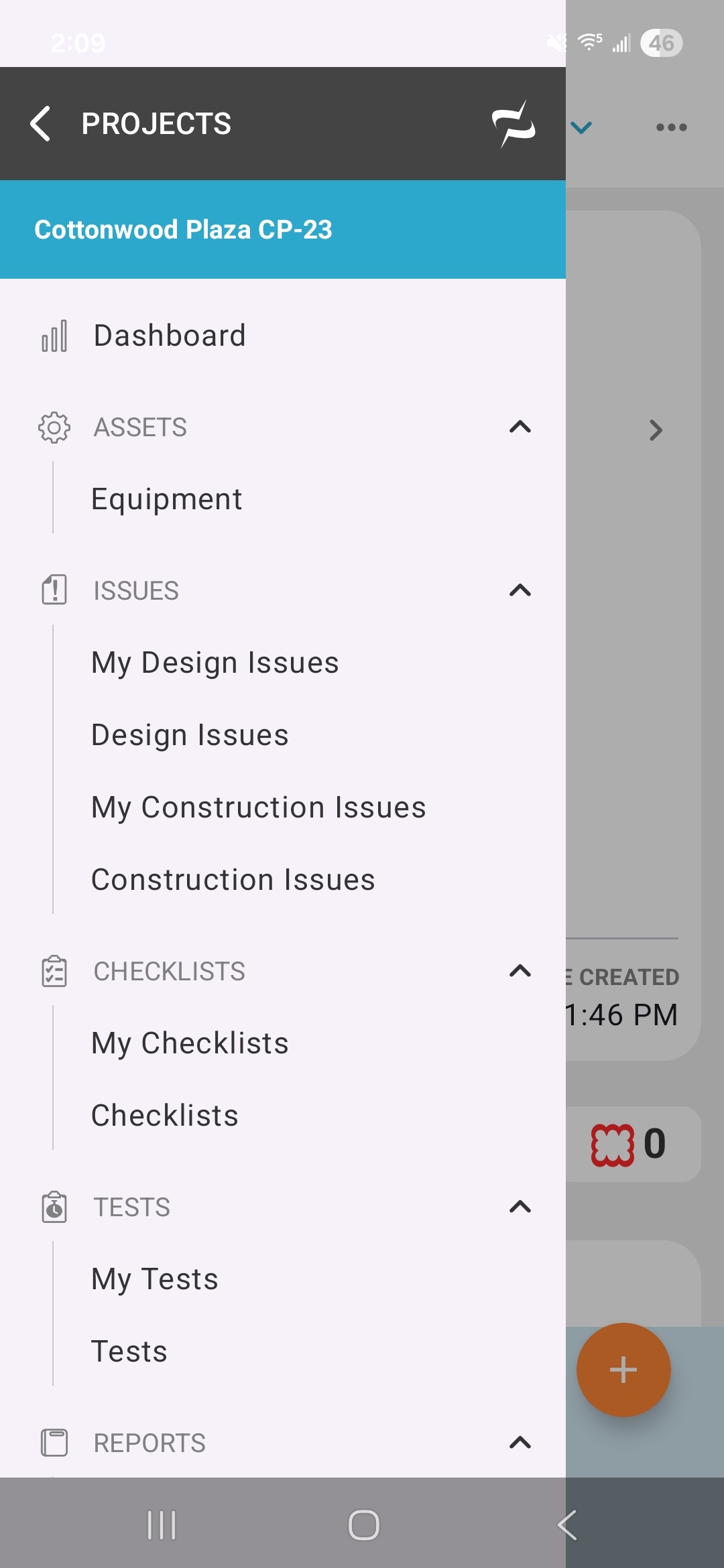
One of the biggest improvements is navigation. Android’s back button allowed us to reconsider the basic flow of moving through the app. Because the back button makes it trivial to return from a detail view back to a list, we no longer needed to show a back arrow in the interface. That freed us to keep the project menu available on every screen, regardless of where you are in the app.
Bottom Sheets
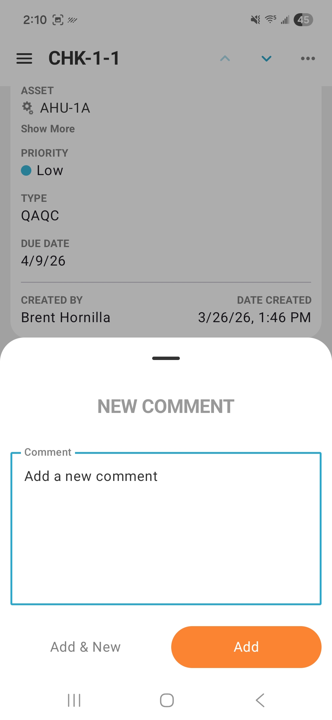
Many actions that previously navigated to another screen now open in a bottom sheet. Adding a comment, for example, used to open a full screen view. Now it opens right where you are. There’s no navigation, so you don’t lose your place and you don’t have to navigate back since you never left.
List Enhancements
Sorting and Filtering
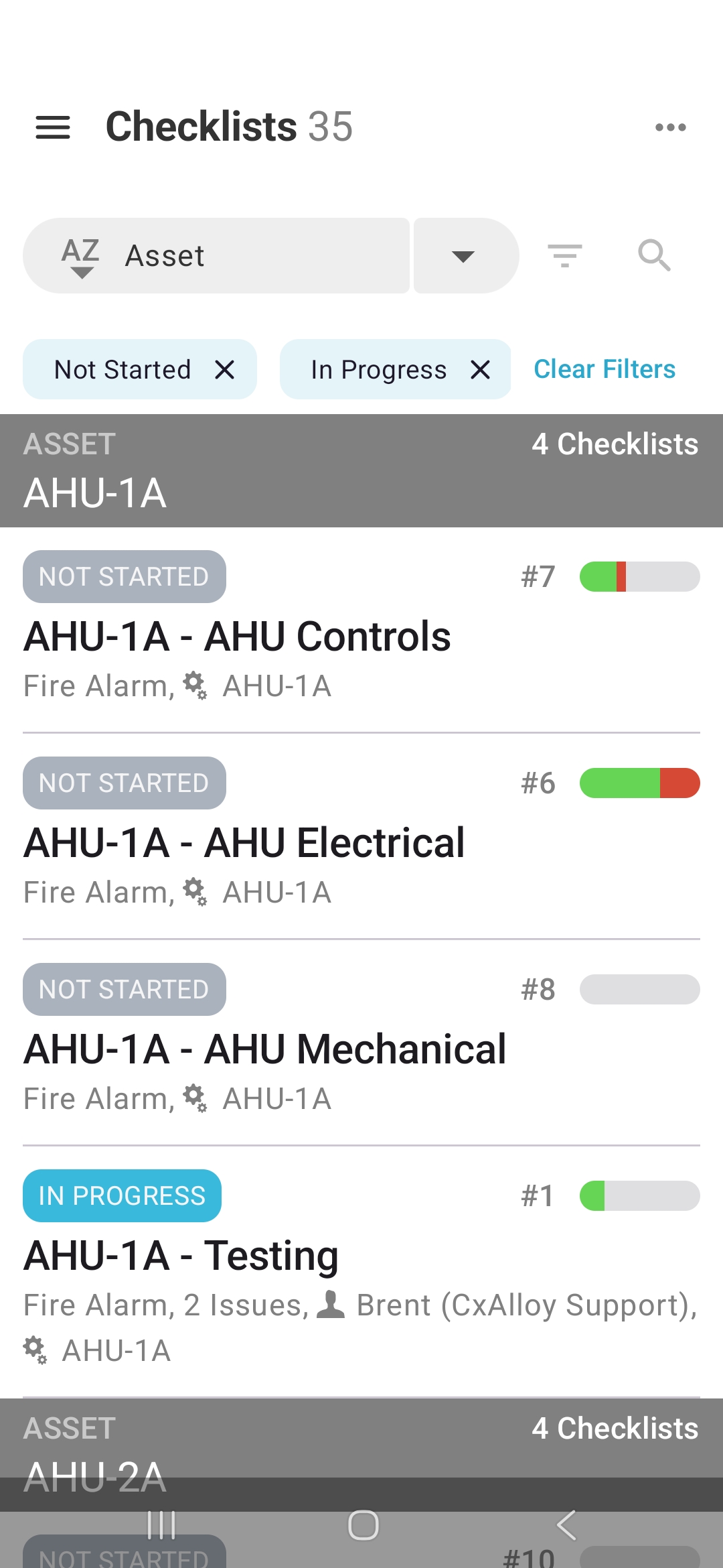
The biggest change in lists is how filter and sort options are exposed. Active filters are now shown as chips above the list, no longer hidden inside the filter panel. Removing an individual filter, or clearing all of them, is a single tap. Sorting controls sit directly above the list, making it easy to switch sorts and toggle between ascending and descending order.
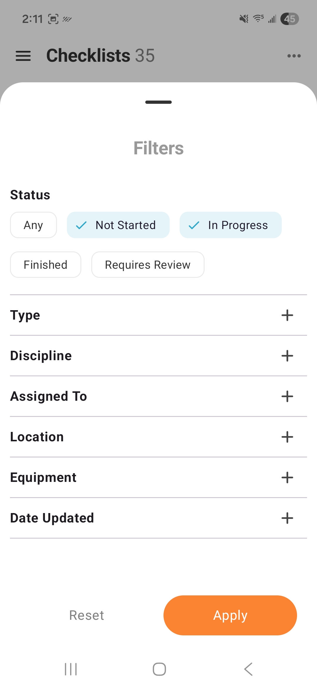
The filter panel has also been redesigned so that options with only a few choices can be selected with one-tap chips instead of requiring navigation to another view.
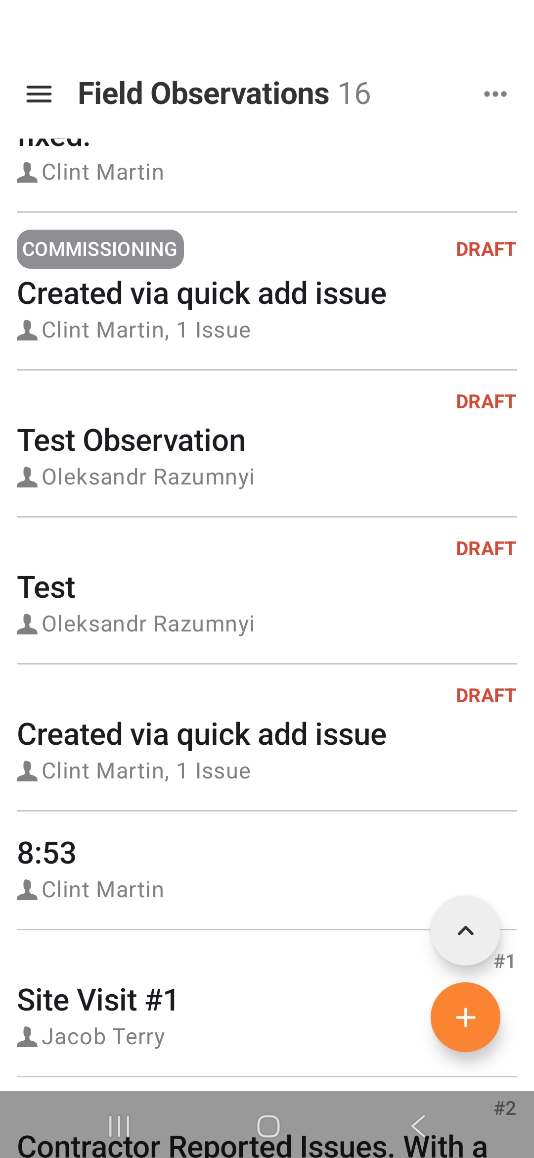
Scroll to Top
We also added a dedicated “Scroll to top” button. One thing we really missed from iOS is the ability to quickly scroll to the top of any screen. CxAlloy has a lot of long lists, and being able to return to the top quickly is something field teams use constantly. On iOS, that functionality is built in. We wanted it on Android too, so we added a dedicated button. It only appears after you’ve scrolled down, and it floats above the Floating Action Button.
Revamped Detail Views with Quick Tabs
Quick Tabs
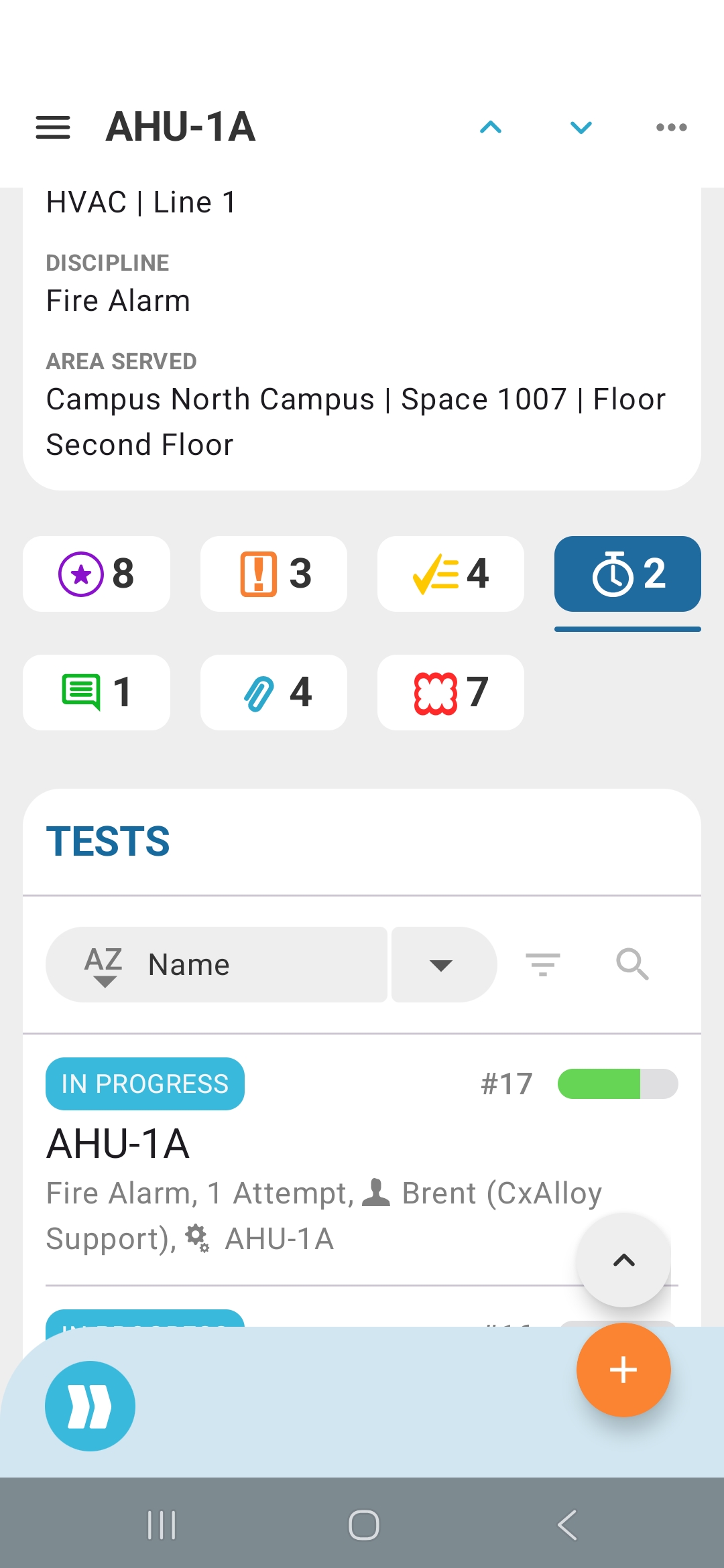
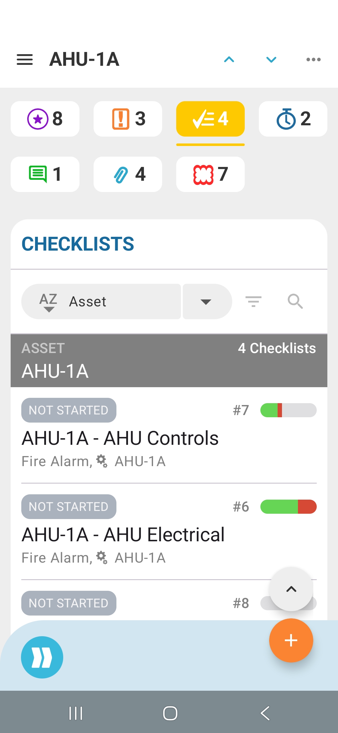
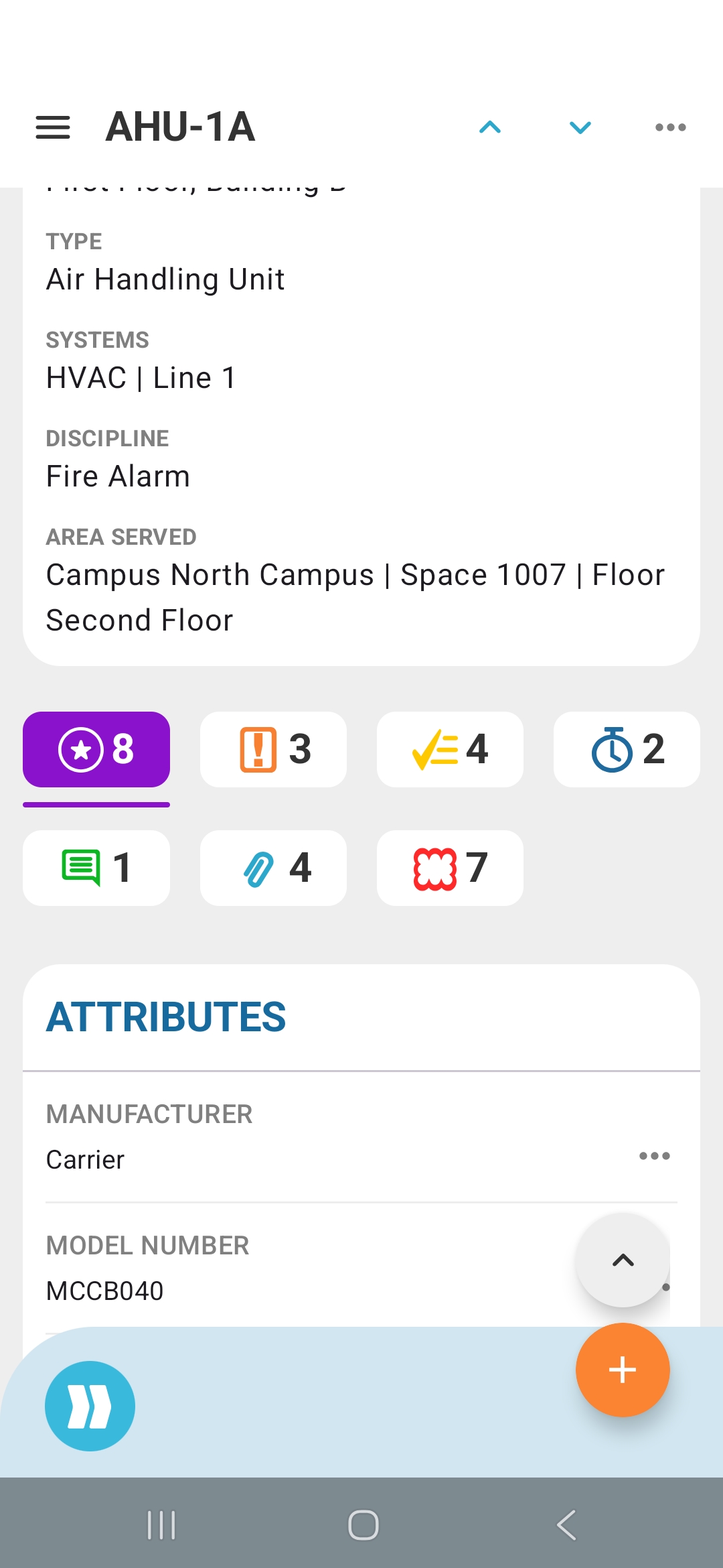
Detail screens have been improved as well, especially with the addition of quick tabs. Quick tabs are probably my favorite change in this redesign. They do two things at once. First, they serve as a mini summary of all related content, with easy-to-see counts for comments, issues, attributes, photos and files, callouts, signatures, checklists, and tests. Second, they make it fast to access that content. Tap a quick tab and you immediately see the full list of related content without leaving the screen. Those lists also carry the same capabilities as the main lists, so you can filter, sort, and search within them.
Content Visibility
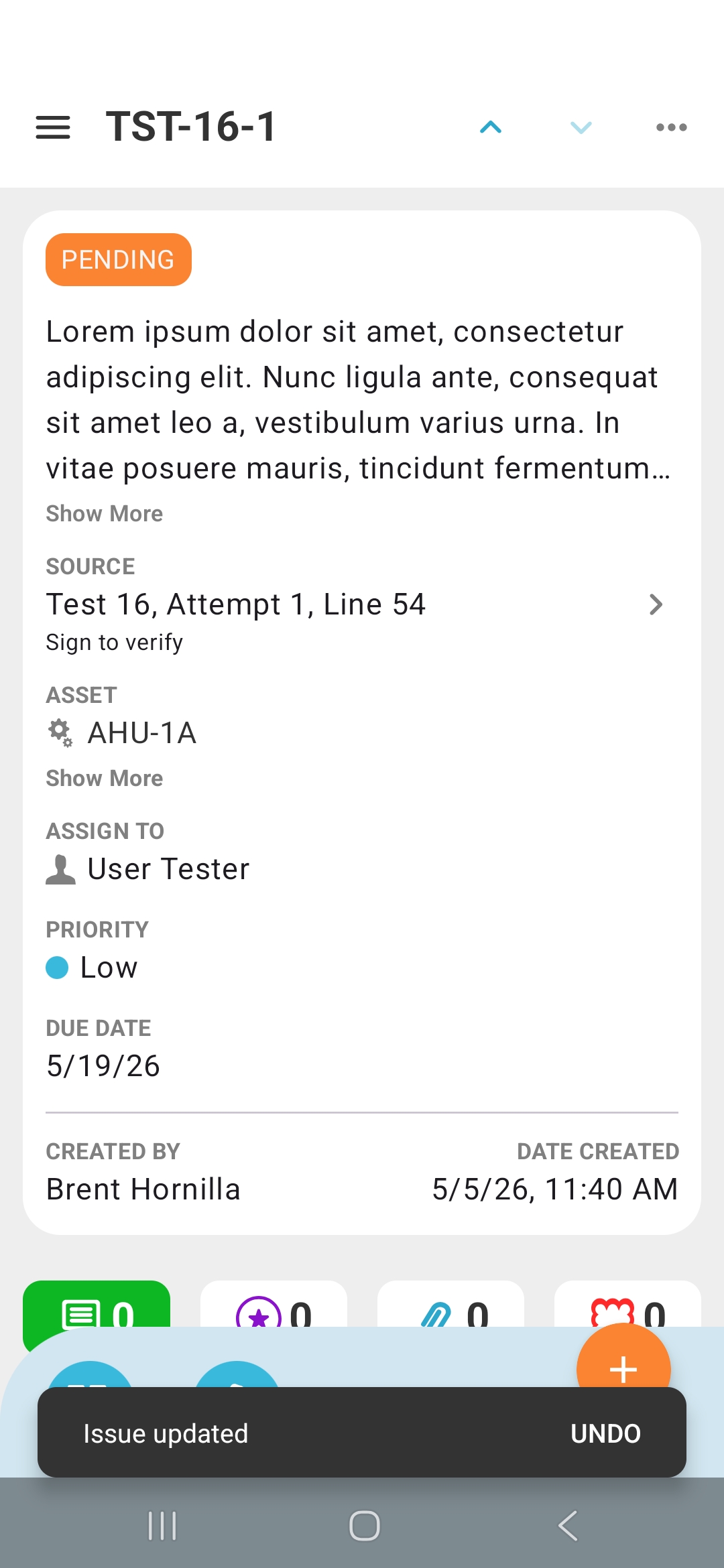
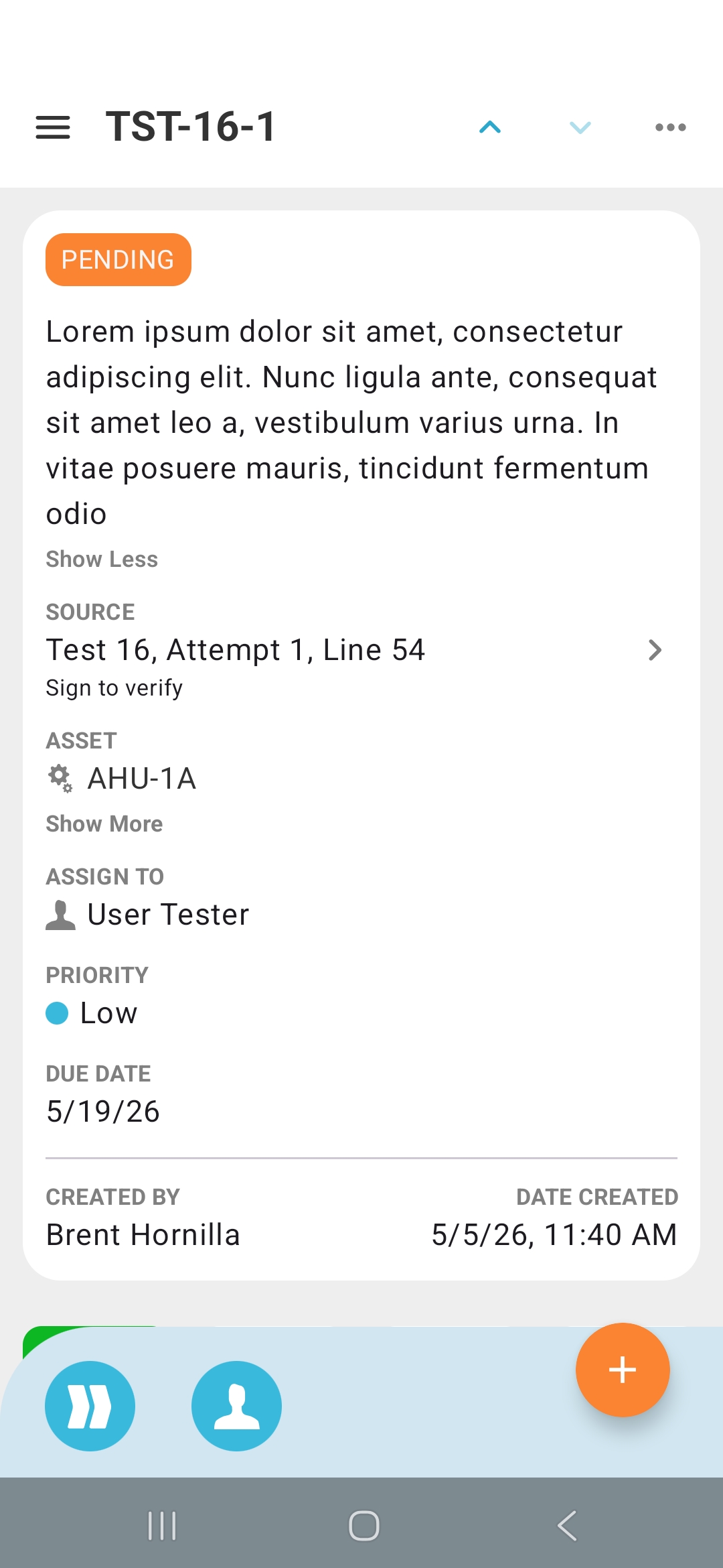
One of the goals in this redesign was to make it easier to get the full context of an issue, equipment item, checklist, or test. Along with quick tabs, we added “Show more” controls so that long issue descriptions don’t push other content off the screen.
Checklist and Test Lines
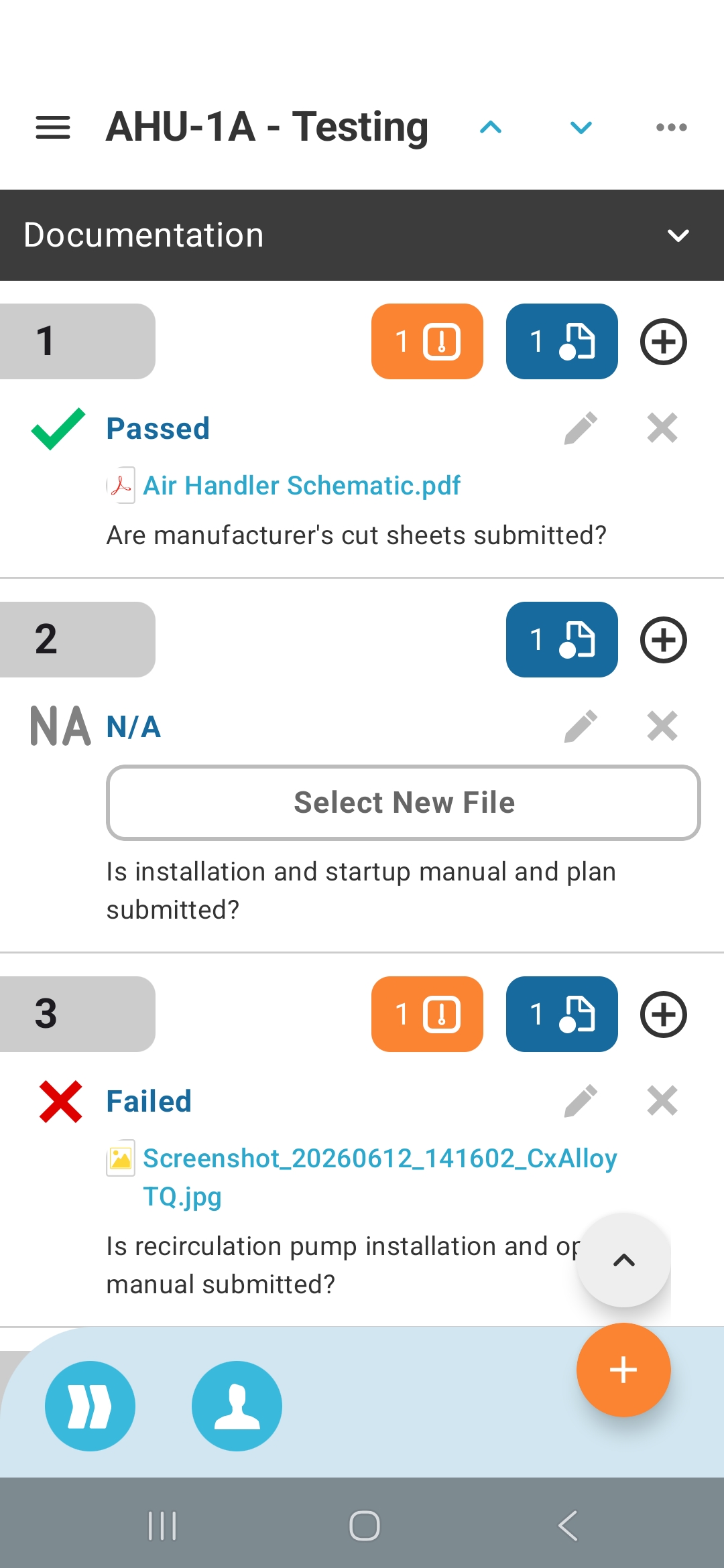
We also updated the presentation of checklist and test lines to reduce clutter. Secondary actions for a line, such as adding an issue, photo, file, or note, are now consolidated under a single button. At the same time, we know how useful it is to scroll through a checklist and quickly see which lines have related content, so when a line has attached issues or files, colored indicators still call those out. Tap an indicator to view those issues or files directly.
Floating Action Button
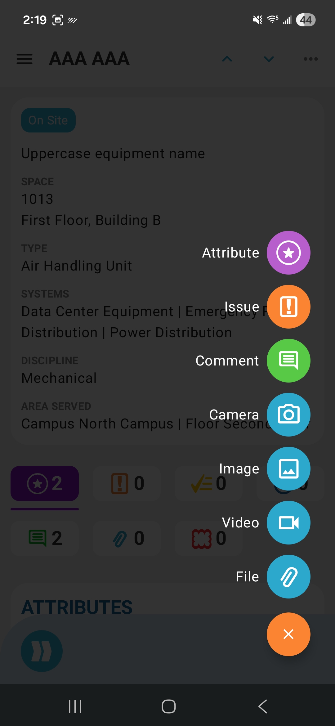
The Floating Action Button (FAB) provides a consistent control for adding content wherever you are in the app.
On list pages, tapping the FAB opens context-relevant create forms. On the issue list, it opens the Quick Add Issue form. On the equipment list, it opens the New Equipment form.
On detail pages, tapping the FAB presents a menu of all child content that can be added to that item. On an issue, that means adding a comment, issue attribute, photo, or file.
Dashboard
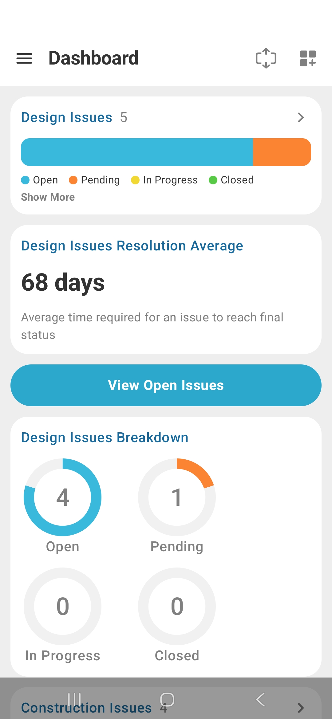
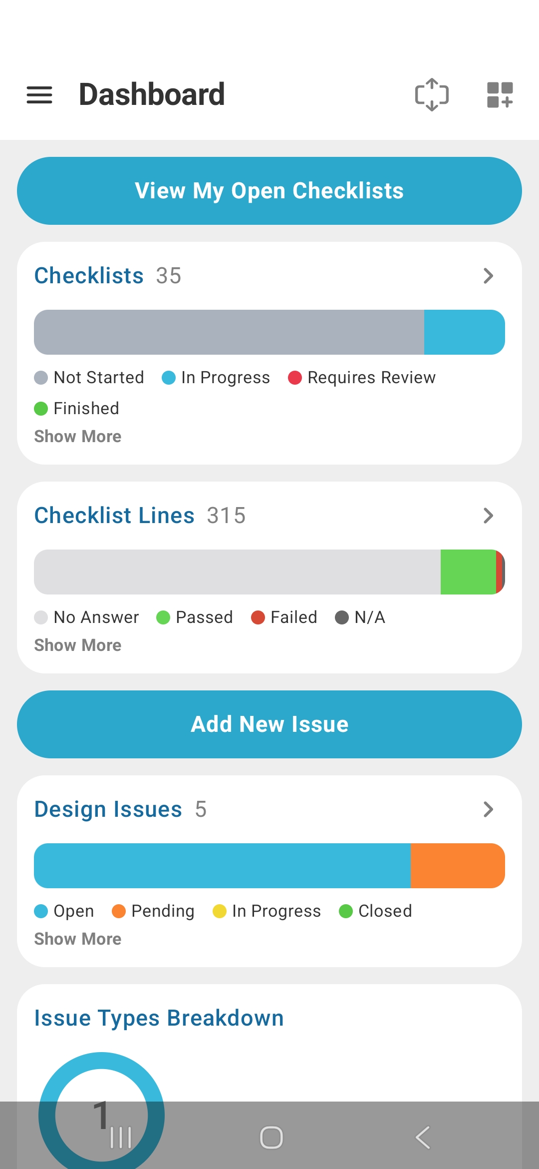
The dashboard has been updated to match the recent revamp on iOS. You can now customize it with the widgets of your choosing, including new quick action buttons like “View My Open Issues,” “Add Issue,” “View My Open Checklists,” and more.
Pursuing Perfection
This redesign includes other improvements as well: better performance and enhanced support options. Our goal has always been to have the best commissioning software available, and that means the best iOS and Android apps. The Android redesign is another step in that direction.